How did you use media technologies in the construction and research, planning and evaluation stages?
Wednesday, 30 April 2014
Monday, 28 April 2014
Sunday, 27 April 2014
Evaluation Question 2
How effective is the combination of your main product with your ancillary task?
Saturday, 26 April 2014
Evaluation Question 1
In what ways does your media product use, develop or challenge forms and conventions of real media products?
Thursday, 24 April 2014
Tuesday, 22 April 2014
My Magazine Advert
This is my final magazine advert:

This is the final magazine advert that I have created for my album - 'Criminal'. I am very happy with this magazine advert as it is kept simple, and professional in order for audiences to take in the information printed correctly. However I believe it isn't boring as the image of the album cover on the front creates continuity which will also attract audiences' eyes to the album on store shelves, as well as a brand identity being established. Also there is input from NME and Q on the advert which states that top magazines think the album is worthy of four stars which will also persuade audiences to buy the product. Furthermore it also tells audiences that they can find out more on LarsM's website. Also there is information on how to purchase the album on iTunes. There is reference to the hit single as well which reinstates popularity with the fans. I wanted the text to be the same throughout the advert to make it look more professional.
To create this magazine advert I used powerpoint which is a programme I am very familiar with having used it for other projects.
To create this magazine advert I used powerpoint which is a programme I am very familiar with having used it for other projects.
Tuesday, 15 April 2014
My Digipak
This is my final digipack insert

This insert for my digipak follows the brand identity of the album cover also. The red filter used over the image is similar to some of the shots used in my music video too where I used a red filter, this helps audiences to recognize the video as does it fit in with house genre. This helps to create a link between all of my products, also it gives a house feel. I have tried to not over complicate things as the design itself is quite unique, taking inspiration from Benny Benassi's album - Electroman.
This is the CD for my digipak

This CD cover fits in with the theme throughout the whole digipak to create brand identity. The image of the artist will again make audiences more familiar with the band. Furthermore the image is unique as not many CD's feature pictures of an artist, which challenges conventions, however it could be used as a selling point as fans may get excited as having something unique. Also there is no need to print the name of the artist on the CD as it is clearly printed on the album cover and on the insert.
This is the front cover for my Digipak

This will be the front cover of my digipak. I have chosen this one as there is brand identity with the same theme as the magazine advert. Also there is links with the video in terms of the filter used which keeps the abstract feel, and demonstrates the genre of house music. taking inspiration from Benny Benassi's album - Electroman.
This is the back cover for my digipak

The back cover for my album yet again is similar to the rest of my products, the space feel creates continuity. Moreover the name of all the tracks are listed here to ensure audiences of what they're getting. Also there is a bonus track which will excite fans and help to sell the album. There is also a bar-code to make it as close to realism as possible. The record label logos are also printed on the back which will attract the audience to the album as they may know of other artists of this record label. I have also put the name of the artists website on the back to show a combination of media forms.
Saturday, 12 April 2014
Actions From Rough Cut Feedback
After hearing some input from my classmates and friends i decided to take action and make some changes to my video. Also it was evident to me tat some changes were needed.
These were the changes i made:
These were the changes i made:
- I made the video longer as it is now 3:04 minutes. I did this by having more filming time and filming shots such as the traffic scenes.
- I also added some more shots to add to the theme of a journey to make it a little more clear.
- I also edited some of my filters to make it more effective to watch.
Friday, 14 March 2014
Editing Process
Throughout my project I had to do a lot of editing in order to make my video the best it could be. Also a lot of editing went into my evaluation questions.
After i figured out that the beat of the music changes every 1.8 seconds i was able to edit my video in sync to the music.


After i figured out that the beat of the music changes every 1.8 seconds i was able to edit my video in sync to the music.
For my video i used a variety of different filters in order to create an abstract feel. Also this fits in with the genre of house music.
For example in this shot used a red filter. This is how i did it:
Select the clip i wished to use to add a filter. Then select edit video, and add a filter, as you can see here i have added a red filter.
Also i sped up the pace of some of my shots as well as slowing them down. I did this in a similar way, however there were some slight changes. This is how i did it:
Select the clip i wished to use to speed up or slow down, Then select edit clip and either drag the bar to which ever speed or edit it manually. as you can see here i changed the speed to 280%.
I also used a cutaway to combine two sots together, furthermore i changed the capacity to what i wished. This is how i did it:
I dragged the clip i wished to use in the cutaway over another clip, i then selected 'cutaway' on the options bar, i then selected what percentage i wanted the capacity at, as you can see here it is at 29%.
I also used effects when editing my evaluation questions. This would make it more entertaining to watch. I used effects here such as picture in picture and side by side.
Here is an example of a picture in picture edit.
Here is an example of a side by side edit.
Thursday, 13 March 2014
Research For Magazine Advert
For my project I also have to create a magazine advert for the album.
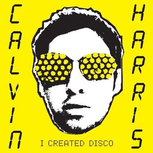
Here is an example of a magazine advert for Calvin Harris' album - I Created Disco

.jpg)
This magazine advert will help to sell Calvin Harris' album. There is a clear sense of brand identity as it has a very similar theme to the album cover with the yellow background, the printed image and the text. This will help to sell the album as people will be familiar with it, also it stands out so it will be easy to find in the shops and its easily recognizable. The image of the artist on the front also uses brand identity as it helps to sell the image to fans. Also this will help to reinstate the artists star image for the album, in order for it to sell.
Furthermore there is also a date listed - 11th of June for when the album is released, this bit of information is crucial to fans as it lets them know when the can purchase this item. Also there is a link to Amazon on there which tells audiences where they can purchase.
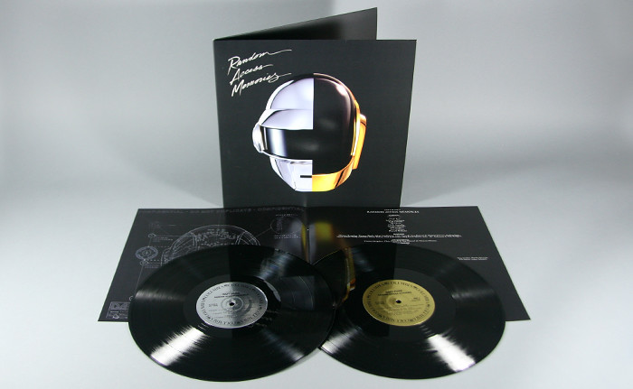
Another advertisment i chose to analyse was for Daft Punks album - Random Access Memories. Here is an image of this advert.

This magazine advert also creates a clear sense of brand identity. All Daft Punk fans and a lot of the music industry and audiences will be very familiar with the helmet that Daft Punk use to create a sense of identity. Moreover as the band consists of two artists, we see that the helmet is split into two to emphasize the importance of both artists. Also this advert is a similar layout to the album front cover which helps to reinstate brand identity, this is useful as audiences will be able to notice this when purchasing the album in shops.
There is a date on the album cover which is useful to fans as they are kept informed on when they can purchase the album. As you can see the record label are also printed on there which shows the public that they are a big group as the are signed by Columbia which works with massive artists such as Beyonce. It also shows you where to download the song, form ITunes, this helps sell the album for the band, however also helps audiences.
These magazine advert covers promoting albums has inspired me to create a brand identity for my music video and both ancillary tasks.
Here is an example of a magazine advert for Calvin Harris' album - I Created Disco
Furthermore there is also a date listed - 11th of June for when the album is released, this bit of information is crucial to fans as it lets them know when the can purchase this item. Also there is a link to Amazon on there which tells audiences where they can purchase.
Another advertisment i chose to analyse was for Daft Punks album - Random Access Memories. Here is an image of this advert.

This magazine advert also creates a clear sense of brand identity. All Daft Punk fans and a lot of the music industry and audiences will be very familiar with the helmet that Daft Punk use to create a sense of identity. Moreover as the band consists of two artists, we see that the helmet is split into two to emphasize the importance of both artists. Also this advert is a similar layout to the album front cover which helps to reinstate brand identity, this is useful as audiences will be able to notice this when purchasing the album in shops.
There is a date on the album cover which is useful to fans as they are kept informed on when they can purchase the album. As you can see the record label are also printed on there which shows the public that they are a big group as the are signed by Columbia which works with massive artists such as Beyonce. It also shows you where to download the song, form ITunes, this helps sell the album for the band, however also helps audiences.
These magazine advert covers promoting albums has inspired me to create a brand identity for my music video and both ancillary tasks.
Saturday, 8 March 2014
Shot list
This is a shot list of my final cut.
Shot 1, 3, 5, 7, 9, 11, 13, 15,: High angle of protagonist feet - red filter
Shot 2, 4, 6, 8, 10, 12, 14, 16: high angle of protagonist feet - green filter
Shot 17: Panning shot from protagonist eye-line, negative filter.
Shot 18, 20, 22, 24, 26: High angle shot of protagonist feet on skateboard, X-ray filter.
Shot 19, 21, 23, 25, 27: High angle shot of protagonist feet on skateboard, Cartoon & purple filter.
Shot 28: Tracking shot/ POV shot on skateboard, negative filter.
Shot 29 - 37: Tracking shot of the atmosphere, range of filters.
Shot 38 - 46: Tracking shot of alleyway, range of filters.
Shot 47 - 54: Tracking shot of walkway, range of filters.
Shot 55: long shot of the moon, window cutaway.
Shot 56 - 71: High angle shots of protagonist feet, range of filters.
Shot 72: Extreme closeup of condensation on window.
Shot 73, 75, 77, 79, 81: Tracking shot on a moving vehicle, range of filters.
Shot 74, 76, 78, 80, 82: Establishing shot at high angle of moving vehicles, range of filters.
Shot 83 - 87: Close up, zoomed in of traffic, range of filters.
Shot 88 - 92: Long shot of moving traffic, different filters.
Shot 93, 95, 97, 99, 101, 103: Close up of moving traffic, hard light filter.
Shot 94, 96, 98, 100, 102, 104: Close up of moving traffic, cutaway high angle of protagonist feet.
Shot 105: Slow motion cutaways of traffic and high angle of protagonist feet.
Thursday, 6 March 2014
Digipak Trials
First attempt


This was my first idea for my album cover. With inspiration from the Benny Benassi album - Electroman i believe it really captures the genre of the music. The back image of space gives the effect that you are in a different world whilst listening to the song. Moreover it is simple and doesn't over complicate things which audiences may find appealing. However i believe that this attempt lacks a little creativity, and looks more like the back of an album cover, thats why i chose not to use it.

Second attempt
This was my second attempt at creating an album cover. As the song is called 'Criminal' i had the idea of taking a mugshot of the artist. Furthermore this links visuals with the title of the song. This may influence the idea that after a long night listening to LarsM music, whether thats in a club or on an adventure, the wildness of it got too much therefore it resulted in getting arrested. However i didn't use this idea as I don't think it would give out the right idea, almost glorifying being arrested, also i believed that it didn't really fit in with the genre and was more suitable for a hip-hip or rock song.
Third attempt
Out of the three album covers, this was the one I liked most. I love the retro feel it gives out and as you see the cover you instantly think of house music, which will really help to sell the album also. Also the yellow background makes the artist stand out which gives some sort of brand identity. Moreover the rugged feel to it also fits in with the genre of house. The artist name and album name clearly stands out with the black font on the yellow background, which draws people in. Most of the inspiration from this cover came from Calvin Harris' album - I created disco.

Audience feedback on digipak trials:
I decided to ask my classmates and friends to give me some feedback on my digipak ideas.
For the first attempt i got feedback stating that it was a good theme however lacked creativity.
For my second attempt feedback was that it was a good idea however as i thought it didn't really fit with the genre of house music, despite the song name being called Criminal.
For the third attempt feedback included that it was too much of a copy of the exact Calvin Harris album. This attempt lacked creativity therefore i didn't use it.
Feedback from people also said that there was no clear brand identity being established. Also these digipack didn't seem to form bonds and relationships with fans as there was no appeal to the target audience. Therefore i decided not to use any of these digipaks.
Tuesday, 4 March 2014
Friday, 28 February 2014
Thursday, 27 February 2014
Sample Fonts
I used word to create a few sample fonts that I may use in my digipack ans for my magazine advert.

As you can see these fonts are all very different however effective in their own way. The first font has a more formal however classy look to it, similar to the one used in the Daft Punk Digipack
The second font is more formal and straight forward. This is similar to what you would see in a newspaper, this font challenges the codes and conventions of house genre however i believe with the right digipack it could look very effective.
The third font follows the typical conventions of house as it has a retro feel to it, this reinstates the a party atmosphere.
The fourth font is very ordinary and may be used in a more simple advertisement or digipak.
Digipak Examples - Daft Punk
Daft Punk - Random Access Memories

This is the digipak for Daft Punks album: Random Access Memories
The front of this digipack is one of my favorite ones I've edited. I like it because it is very simple however effective as it still puts across a very strong message and brand identity with the images of the helmets which are a massive feature with everything that Daft Punk does. Also the matt black background helps the glimmer and shine of the helmets and font out. Also the font type is different to others i have seen, the David Guetta album presents fonts in an abstract way and the Calvin Harris album presents it a simple computerized way whereas here it is presented in a higher class fancy way which almost challenges the codes and conventions house music as it is usually rough and edgy, therefore I like this idea.

There is a theme presented as if the digipak is from the future, with the helmets, the shine etc. The insert as you can see seems very much in the future with the images of the hi-tech skeletons presented under the helmet almost makes it seem like they are from a different planet. This could be the kind of message they are trying to present, claiming that they are unique from other artists and bands. Also there is a sense of brand identity in the sense that it has kept simple and luxurious.
Furthermore as you can see the albums presents the CD as a record instead, this helps to keep it unique however it has a formal feel and could also show a glimmer of the future. Also the two colours in the middle of the CD represent the colours of the helmets for each artist which is also reinstating the theme of luxury as well as brand identity.
Thursday, 20 February 2014
Saturday, 8 February 2014
Location and setting
I aim to film most of my shots in urban areas for example: alleyways, streets etc. As i wanted to portray the theme of a journey.
Also I want to films some shots on a park to reinstate a a fun atmosphere, also here I could create some panning sots and a range of different shots on apparatus.

Also i want to film some shots in a busy atmosphere for example in the town centre.

Also some of my shots I want to film at night for example the shots of the traffic as i think this would be more effective to zoom in and use different filters.

Also I want to films some shots on a park to reinstate a a fun atmosphere, also here I could create some panning sots and a range of different shots on apparatus.
Also i want to film some shots in a busy atmosphere for example in the town centre.
Also some of my shots I want to film at night for example the shots of the traffic as i think this would be more effective to zoom in and use different filters.
Friday, 7 February 2014
Digipak Examples - The Beatles
After doing some general research into digipacks I am now going to go into a more depth analysis.
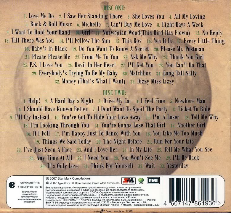
The Beatles 'Greatest Hits Part 1'
Front Cover:

This album cover is very old fashioned, the dark colours signify the the years of their greatest hits - 1962-1965. The balck and white image of the band at the front is in black and white, which is how the photo would of been taken, the style of the band members, formal suits and moped hair shows the classic era from when they hit fame. Also the brown, old paper type background also refers back to the era they were famous, also this shows what to expect in terms of soft rock music. Furthurmore the iconc Beatles logo in the top left will help audiences identify brand identity when seeing this album in stores.

The back cover of this digipack shows a track list of both disc one and two. The picture of the apple is famous from the record label that produced the album - Apple Records. This image gives the record label a brand identity which people will see and recognise. The green text for Disc one and Disc two may have been used to resemble the colour of the apple.

As you can see on this digipack, the CD is styled as an old record. This brings it back to the 60s era where The Beatles found success, moreover the record may represent a time where they were successful. Also audiences may be reminded of their past listening to The Beatles' music, this may bring back memories, also this will act as a good selling point.
The Beatles 'Greatest Hits Part 1'
Front Cover:

This album cover is very old fashioned, the dark colours signify the the years of their greatest hits - 1962-1965. The balck and white image of the band at the front is in black and white, which is how the photo would of been taken, the style of the band members, formal suits and moped hair shows the classic era from when they hit fame. Also the brown, old paper type background also refers back to the era they were famous, also this shows what to expect in terms of soft rock music. Furthurmore the iconc Beatles logo in the top left will help audiences identify brand identity when seeing this album in stores.

As you can see on this digipack, the CD is styled as an old record. This brings it back to the 60s era where The Beatles found success, moreover the record may represent a time where they were successful. Also audiences may be reminded of their past listening to The Beatles' music, this may bring back memories, also this will act as a good selling point.
Wednesday, 5 February 2014
Research for digipak
A digipack is a patented style of CD or DVD packaging. It is a way of promoting your product to the audience as well as enhancing the consumers experience.

A CD digipack will typically fold out into four sections, this will be in a paper/card gateway form with a plastic tray inside to store the CD disk. Each four sections will feature images/images of the artists to show forms or artistry or their influences, also a list of tracks that feature on the album. The digipack will contain the artist/bands CD, and a bonus item, for example a poster, a DVD of their tour etc.
This is an example of a digipack:

This digipack has a guitar design, a plastic tray to fit the CD disk. It also has a glossy touch around the outside to make it look pleasing on the eye for customers.
Digipacks are designed as a way to attract fans or target audiences. The cover is the vocal point of the digipack so therefore this has to try and catch the eye of consumers. Digipacks also offer a different experience to a fan than just downloading the album of any illegal website. A digipack offers a whole deiiferent experience and sense of belonging to something special. This is the reason digipacks often feature bonus packages to try and entice the consumer, which will also result in financial gain.
I had a look at some digipacks from house artists with a similar image to my chosen artist to gather some ideas together.
David Guetta's digipack for the album 'One Love'

This digipack idea has a clear brand identity for house music. With an image of David Guetta as the vocal point posing with his sunglasses on gives us the feel that the album will be full of party/festival songs. Also the artistry and blend of colours in the fold outs gives us a summer feeling which may be a message David Guetta is trying to put across
Swedish House Mafia's digipack cover for 'Until Now'

This digipack is similar to David Guetta's in the way it distinguishes a brand identity, however the artwork and effects of the image on the front have a more dark/rebellious feeling to it.
I feel that i should still be open to viewing ideas from digipacks from artists/bands from different genres as this may still help me.
Here is the front cover of Eminems album 'Recovery'

I feel that i should still be open to viewing ideas from digipacks from artists/bands from different genres as this may still help me.
Here is the front cover of Eminems album 'Recovery'
This cover is different from the other two as it doesn't have a clear brand image of the artist. This is because Eminem is well established and he would think his album will sell its self. Also the image of him walking along an empty road fits into the title of the album 'Recovery'. The picture signifies that the artist is on the road to recovery. The image is artistic in itself, however the aid logo in the title is the only bit of artistry used in terms of effects.
Saturday, 1 February 2014
Digipak Examples - David Guetta
David Guetta - One Love
Whilst doing some in depth research into digipaks i though it would be best to focus some attention to house music artists.

This front cover of David Guetta's album has a very strong identity. You can tell that he is a house artist due to his clothes and the thing that stands out the most - his sunglasses. Also the dark colours give the album a party/club feel which is one of the conventions of house music. Also the bold purple font over the dark background colours help it to stand out, audiences will be drawn to this album title, which may guide them into buying the product or informing friends of the artists album. Also the image of the artist on the front cover gives it a clear brand identy

The CD has a very bland grey base coulour which helps to bring out the abstract font covering it, this font is black and purple which fits in with the theme on the front cover, adding continuity. The back cover gives a list of the songs on the album to make it recognizable to the audience. There is also a sense of brand identity throughout the whole digipak in terms of the colours used and the font. All of this will help to sell the project.
Friday, 31 January 2014
Audience feedback
I asked many of my classmates aswell as friends to watch my rough cut and give me their honest opinion, whether this would be positive feedback or negative.
These are some of the main points that were said:
These are some of the main points that were said:
- The link between music and visuals were good. They thought that the editing was in time with the music which help to identify that my genre was house.
- Also the different filters I used was received well and people said it gave off a house/dance feel.
- Alo the speeding up of shots and the slowing down of clips was perceived well as people said it it in with the genre codes and conventions.
- People said however that at 2:25 seconds my video was a little bit too short
- Also people said that the narrative wasn't clear, however my videos doesn't have a particular narrative due to the genre, just an element of a journey theme
- Also people said that i needed to change some of my filters.
Record Labels
I researched many different record labels to see which one i could use for my own artist.
One of the most popular and well established record label for successful house music artist is Columbia. Columbia have signed many famous house artists such as Daft Punk and Calvin Harris.
Another record label is Skint Records. This is a Brighton based dance and house music record label, they are highly credited for producing music for Fat Boy Slim, FreQ Nasty and Hardknox.
Big Beat records is an East Coast hip-hop and dance music record label. Originally a house music record label it has branched out to hip-hop and has produced music for Lil Kim and Junior mafia. Today Big Beat records include artists such as Skrillex.
Spinning is an independent Dutch record label which has produced music for Afrojack along the years and of late, music for the young talented Dutch DJ Martin Garrix
For my artist i have decided to go for Columbia and Spinnin' Records. Columbia are a popular well established record label which will provide good contracts and mainstream success is alost a guarantee as they have produced music along the years for Frank Sinatra, Beyonce and Daft Punk. Furthermore Spinnin' Records are known to give young talent a chance in the music world, signing young artists such as Martin Garrix who has proved to be successful.
I believe that these two record labels combined will bring great success to Jordan Morgan music.
An example of Beyonce's music video 'Single Ladies' produced by Columbia:
Afrojack Rock the House music video produced by Spinnin' Records:
Friday, 24 January 2014
Filming Schedule
I plan to do my filming within a ten day time period. This
will give me time to work on editing my filming in order to post a rough cut,
and then editing my footage for my finished video. Furthermore as I plan to use
a range of different weather settings this time frame will hopefully allow me
to do this.
11th January
This was my first filming attempt. Here I filmed the opening
scene for my music video, thus was all done between the times of 7am-9am. The
weather was sunny but also cold and fresh which is what I wanted. I didn’t get
along with filming the rest of my song as I felt the conditions were not right
for particular scenes. Also I wanted to film my footage in chronological order
as this would help me to keep things organised.
15th January
On this day I filmed the second part of my filming. I filmed
midday as I wanted time to reflect the day of an individual throughout my
video. Moreover this was a day that I was able to have someone feature in my
video. Also as the weather stayed ok I was able film outside as well. Also I
was also able to film shots such as bus journeys on this date.
19th January
I finished filming most of my video on this date, here I filmed a lot of the shots i wanted to make abstract. I also wanted to film some shots connoting a journey.
I finished filming most of my video on this date, here I filmed a lot of the shots i wanted to make abstract. I also wanted to film some shots connoting a journey.
After editing most of my videos there were a few shots that
I felt I needed to re-film, so I did this on necessary dates which were dependent on factors such as the weather.
Tuesday, 7 January 2014
Rough Cut
This is the first roughcut of my music video. I edited this after my first few filming sessions, in order to gather feedback from my classmates and friends. This would allow me to make changes and improve upon my video.
Sunday, 5 January 2014
LarsM
I'm going to do a brief overview of my artist which will allow me to get a little more familar.
LarsM is the stage name for a Polish music producer called Kamil Relikowski. His passion for music has been credited by some famous names such as Avicii. Since then this young talent has put his heart and soul into every beat.
The first record LarsM released was called Waveshock which was shortly followed by the single Brilliance. LarsM clearly has a bright future ahead of him with big record labels looking to sign him soon.
Here is the song i have chosen by the artist.
Subscribe to:
Comments (Atom)