This is the digipak for Daft Punks album: Random Access Memories
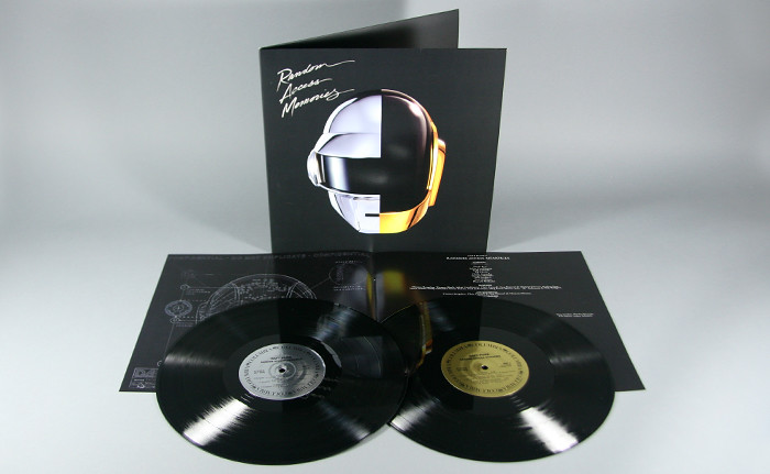
The front of this digipack is one of my favorite ones I've edited. I like it because it is very simple however effective as it still puts across a very strong message and brand identity with the images of the helmets which are a massive feature with everything that Daft Punk does. Also the matt black background helps the glimmer and shine of the helmets and font out. Also the font type is different to others i have seen, the David Guetta album presents fonts in an abstract way and the Calvin Harris album presents it a simple computerized way whereas here it is presented in a higher class fancy way which almost challenges the codes and conventions house music as it is usually rough and edgy, therefore I like this idea.

There is a theme presented as if the digipak is from the future, with the helmets, the shine etc. The insert as you can see seems very much in the future with the images of the hi-tech skeletons presented under the helmet almost makes it seem like they are from a different planet. This could be the kind of message they are trying to present, claiming that they are unique from other artists and bands. Also there is a sense of brand identity in the sense that it has kept simple and luxurious.
Furthermore as you can see the albums presents the CD as a record instead, this helps to keep it unique however it has a formal feel and could also show a glimmer of the future. Also the two colours in the middle of the CD represent the colours of the helmets for each artist which is also reinstating the theme of luxury as well as brand identity.
No comments:
Post a Comment