Friday, 28 February 2014
Thursday, 27 February 2014
Sample Fonts
I used word to create a few sample fonts that I may use in my digipack ans for my magazine advert.

As you can see these fonts are all very different however effective in their own way. The first font has a more formal however classy look to it, similar to the one used in the Daft Punk Digipack
The second font is more formal and straight forward. This is similar to what you would see in a newspaper, this font challenges the codes and conventions of house genre however i believe with the right digipack it could look very effective.
The third font follows the typical conventions of house as it has a retro feel to it, this reinstates the a party atmosphere.
The fourth font is very ordinary and may be used in a more simple advertisement or digipak.
Digipak Examples - Daft Punk
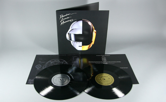
Daft Punk - Random Access Memories

This is the digipak for Daft Punks album: Random Access Memories
The front of this digipack is one of my favorite ones I've edited. I like it because it is very simple however effective as it still puts across a very strong message and brand identity with the images of the helmets which are a massive feature with everything that Daft Punk does. Also the matt black background helps the glimmer and shine of the helmets and font out. Also the font type is different to others i have seen, the David Guetta album presents fonts in an abstract way and the Calvin Harris album presents it a simple computerized way whereas here it is presented in a higher class fancy way which almost challenges the codes and conventions house music as it is usually rough and edgy, therefore I like this idea.

There is a theme presented as if the digipak is from the future, with the helmets, the shine etc. The insert as you can see seems very much in the future with the images of the hi-tech skeletons presented under the helmet almost makes it seem like they are from a different planet. This could be the kind of message they are trying to present, claiming that they are unique from other artists and bands. Also there is a sense of brand identity in the sense that it has kept simple and luxurious.
Furthermore as you can see the albums presents the CD as a record instead, this helps to keep it unique however it has a formal feel and could also show a glimmer of the future. Also the two colours in the middle of the CD represent the colours of the helmets for each artist which is also reinstating the theme of luxury as well as brand identity.
Thursday, 20 February 2014
Saturday, 8 February 2014
Location and setting
I aim to film most of my shots in urban areas for example: alleyways, streets etc. As i wanted to portray the theme of a journey.
Also I want to films some shots on a park to reinstate a a fun atmosphere, also here I could create some panning sots and a range of different shots on apparatus.

Also i want to film some shots in a busy atmosphere for example in the town centre.

Also some of my shots I want to film at night for example the shots of the traffic as i think this would be more effective to zoom in and use different filters.

Also I want to films some shots on a park to reinstate a a fun atmosphere, also here I could create some panning sots and a range of different shots on apparatus.
Also i want to film some shots in a busy atmosphere for example in the town centre.
Also some of my shots I want to film at night for example the shots of the traffic as i think this would be more effective to zoom in and use different filters.
Friday, 7 February 2014
Digipak Examples - The Beatles
After doing some general research into digipacks I am now going to go into a more depth analysis.
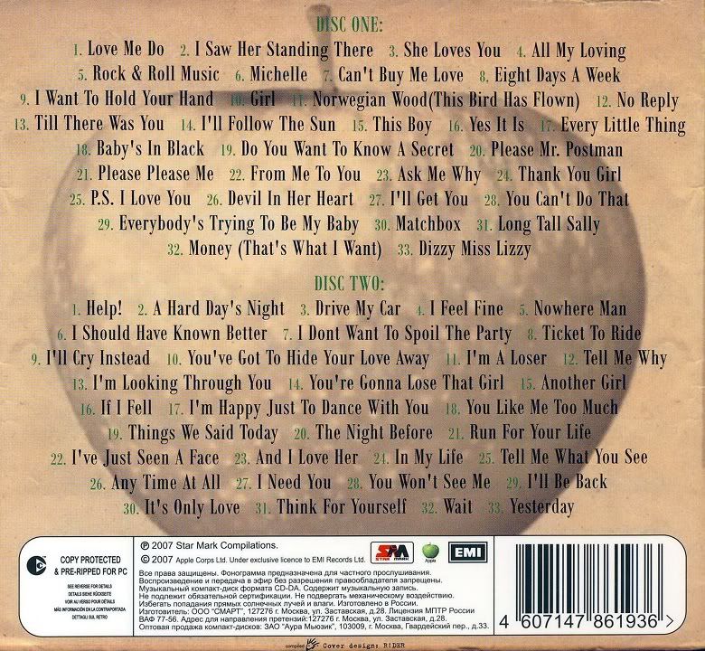
The Beatles 'Greatest Hits Part 1'
Front Cover:

This album cover is very old fashioned, the dark colours signify the the years of their greatest hits - 1962-1965. The balck and white image of the band at the front is in black and white, which is how the photo would of been taken, the style of the band members, formal suits and moped hair shows the classic era from when they hit fame. Also the brown, old paper type background also refers back to the era they were famous, also this shows what to expect in terms of soft rock music. Furthurmore the iconc Beatles logo in the top left will help audiences identify brand identity when seeing this album in stores.

The back cover of this digipack shows a track list of both disc one and two. The picture of the apple is famous from the record label that produced the album - Apple Records. This image gives the record label a brand identity which people will see and recognise. The green text for Disc one and Disc two may have been used to resemble the colour of the apple.

As you can see on this digipack, the CD is styled as an old record. This brings it back to the 60s era where The Beatles found success, moreover the record may represent a time where they were successful. Also audiences may be reminded of their past listening to The Beatles' music, this may bring back memories, also this will act as a good selling point.
The Beatles 'Greatest Hits Part 1'
Front Cover:

This album cover is very old fashioned, the dark colours signify the the years of their greatest hits - 1962-1965. The balck and white image of the band at the front is in black and white, which is how the photo would of been taken, the style of the band members, formal suits and moped hair shows the classic era from when they hit fame. Also the brown, old paper type background also refers back to the era they were famous, also this shows what to expect in terms of soft rock music. Furthurmore the iconc Beatles logo in the top left will help audiences identify brand identity when seeing this album in stores.

As you can see on this digipack, the CD is styled as an old record. This brings it back to the 60s era where The Beatles found success, moreover the record may represent a time where they were successful. Also audiences may be reminded of their past listening to The Beatles' music, this may bring back memories, also this will act as a good selling point.
Wednesday, 5 February 2014
Research for digipak
A digipack is a patented style of CD or DVD packaging. It is a way of promoting your product to the audience as well as enhancing the consumers experience.

A CD digipack will typically fold out into four sections, this will be in a paper/card gateway form with a plastic tray inside to store the CD disk. Each four sections will feature images/images of the artists to show forms or artistry or their influences, also a list of tracks that feature on the album. The digipack will contain the artist/bands CD, and a bonus item, for example a poster, a DVD of their tour etc.
This is an example of a digipack:

This digipack has a guitar design, a plastic tray to fit the CD disk. It also has a glossy touch around the outside to make it look pleasing on the eye for customers.
Digipacks are designed as a way to attract fans or target audiences. The cover is the vocal point of the digipack so therefore this has to try and catch the eye of consumers. Digipacks also offer a different experience to a fan than just downloading the album of any illegal website. A digipack offers a whole deiiferent experience and sense of belonging to something special. This is the reason digipacks often feature bonus packages to try and entice the consumer, which will also result in financial gain.
I had a look at some digipacks from house artists with a similar image to my chosen artist to gather some ideas together.
David Guetta's digipack for the album 'One Love'

This digipack idea has a clear brand identity for house music. With an image of David Guetta as the vocal point posing with his sunglasses on gives us the feel that the album will be full of party/festival songs. Also the artistry and blend of colours in the fold outs gives us a summer feeling which may be a message David Guetta is trying to put across
Swedish House Mafia's digipack cover for 'Until Now'

This digipack is similar to David Guetta's in the way it distinguishes a brand identity, however the artwork and effects of the image on the front have a more dark/rebellious feeling to it.
I feel that i should still be open to viewing ideas from digipacks from artists/bands from different genres as this may still help me.
Here is the front cover of Eminems album 'Recovery'

I feel that i should still be open to viewing ideas from digipacks from artists/bands from different genres as this may still help me.
Here is the front cover of Eminems album 'Recovery'
This cover is different from the other two as it doesn't have a clear brand image of the artist. This is because Eminem is well established and he would think his album will sell its self. Also the image of him walking along an empty road fits into the title of the album 'Recovery'. The picture signifies that the artist is on the road to recovery. The image is artistic in itself, however the aid logo in the title is the only bit of artistry used in terms of effects.
Saturday, 1 February 2014
Digipak Examples - David Guetta
David Guetta - One Love
Whilst doing some in depth research into digipaks i though it would be best to focus some attention to house music artists.

This front cover of David Guetta's album has a very strong identity. You can tell that he is a house artist due to his clothes and the thing that stands out the most - his sunglasses. Also the dark colours give the album a party/club feel which is one of the conventions of house music. Also the bold purple font over the dark background colours help it to stand out, audiences will be drawn to this album title, which may guide them into buying the product or informing friends of the artists album. Also the image of the artist on the front cover gives it a clear brand identy

The CD has a very bland grey base coulour which helps to bring out the abstract font covering it, this font is black and purple which fits in with the theme on the front cover, adding continuity. The back cover gives a list of the songs on the album to make it recognizable to the audience. There is also a sense of brand identity throughout the whole digipak in terms of the colours used and the font. All of this will help to sell the project.
Subscribe to:
Comments (Atom)