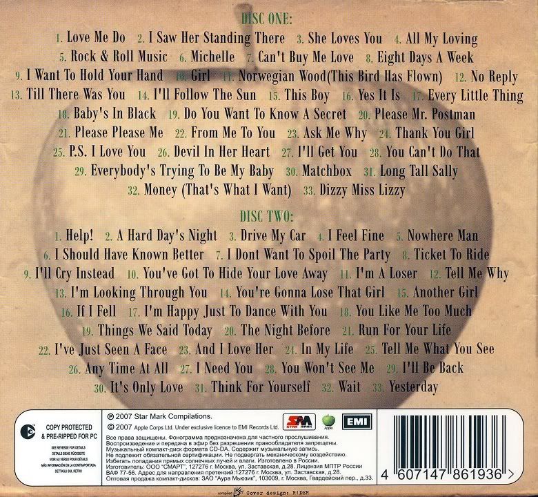
The Beatles 'Greatest Hits Part 1'
Front Cover:
This album cover is very old fashioned, the dark colours signify the the years of their greatest hits - 1962-1965. The balck and white image of the band at the front is in black and white, which is how the photo would of been taken, the style of the band members, formal suits and moped hair shows the classic era from when they hit fame. Also the brown, old paper type background also refers back to the era they were famous, also this shows what to expect in terms of soft rock music. Furthurmore the iconc Beatles logo in the top left will help audiences identify brand identity when seeing this album in stores.
As you can see on this digipack, the CD is styled as an old record. This brings it back to the 60s era where The Beatles found success, moreover the record may represent a time where they were successful. Also audiences may be reminded of their past listening to The Beatles' music, this may bring back memories, also this will act as a good selling point.


No comments:
Post a Comment