Friday, 14 March 2014

Editing Process

Throughout my project I had to do a lot of editing in order to make my video the best it could be. Also a lot of editing went into my evaluation questions. 

After i figured out that the beat of the music changes every 1.8 seconds i was able to edit my video in sync to the music.


For my video i used a variety of different filters in order to create an abstract feel. Also this fits in with the genre of house music. 
For example in this shot used a red filter. This is how i did it: 
Select the clip i wished to use to add a filter. Then select edit video, and add a filter, as you can see here i have added a red filter.


Also i sped up the pace of some of my shots as well as slowing them down. I did this in a similar way, however there were some slight changes. This is how i did it:
Select the clip i wished to use to speed up or slow down, Then select edit clip and either drag the bar to which ever speed or edit it manually. as you can see here i changed the speed to 280%.


I also used a cutaway to combine two sots together, furthermore i changed the capacity to what i wished. This is how i did it:
I dragged the clip i wished to use in the cutaway over another clip, i then selected 'cutaway' on the options bar, i then selected what percentage i wanted the capacity at, as you can see here it is at 29%.


I also used effects when editing my evaluation questions. This would make it more entertaining to watch. I used effects here such as picture in picture and side by side.
Here is an example of a picture in picture edit.


Here is an example of a side by side edit.


Thursday, 13 March 2014

Research For Magazine Advert

For my project I also have to create a magazine advert for the album. 
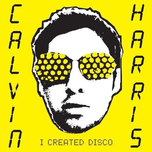
Here is an example of a magazine advert for Calvin Harris' album - I Created Disco


This magazine advert will help to sell Calvin Harris' album. There is a clear sense of brand identity as it has a very similar theme to the album cover with the yellow background, the printed image and the text. This will help to sell the album as people will be familiar with it, also it stands out so it will be easy to find in the shops and its easily recognizable. The image of the artist on the front also uses brand identity as it helps to sell the image to fans. Also this will help to reinstate the artists star image for the album, in order for it to sell.

Furthermore there is also a date listed - 11th of June for when the album is released, this bit of information is crucial to fans as it lets them know when the can purchase this item. Also there is a link to Amazon on there which tells audiences where they can purchase. 


Another advertisment i chose to analyse was for Daft Punks album - Random Access Memories. Here is an image of this advert.


This magazine advert also creates a clear sense of brand identity. All Daft Punk fans and a lot of the music industry and audiences will be very familiar with the helmet that Daft Punk use to create a sense of identity. Moreover as the band consists of two artists, we see that the helmet is split into two to emphasize the importance of both artists. Also this advert is a similar layout to the album front cover which helps to reinstate brand identity, this is useful as audiences will be able to notice this when purchasing the album in shops.

There is a date on the album cover which is useful to fans as they are kept informed on when they can purchase the album. As you can see the record label are also printed on there which shows the public that they are a big group as the are signed by Columbia which works with massive artists such as Beyonce. It also shows you where to download the song, form ITunes, this helps sell the album for the band, however also helps audiences.

These magazine advert covers promoting albums has inspired me to create a brand identity for my music video and both ancillary tasks.

Saturday, 8 March 2014

Shot list

This is a shot list of my final cut.

Shot 1, 3, 5, 7, 9, 11, 13, 15,: High angle of protagonist feet - red filter

Shot 2, 4, 6, 8, 10, 12, 14, 16: high angle of protagonist feet - green filter

Shot 17: Panning shot from protagonist eye-line, negative filter.

Shot 18, 20, 22, 24, 26: High angle shot of protagonist feet on skateboard, X-ray filter.

Shot 19, 21, 23, 25, 27: High angle shot of protagonist feet on skateboard, Cartoon & purple filter.

Shot 28: Tracking shot/ POV shot on skateboard, negative filter.

Shot 29 - 37: Tracking shot of the atmosphere, range of filters.

Shot 38 - 46: Tracking shot of alleyway, range of filters.

Shot 47 - 54: Tracking shot of walkway, range of filters.

Shot 55: long shot of the moon, window cutaway. 

Shot 56 - 71: High angle shots of protagonist feet, range of filters.

Shot 72: Extreme closeup of condensation on window.

Shot 73, 75, 77, 79, 81: Tracking shot on a moving vehicle, range of filters. 

Shot 74, 76, 78, 80, 82: Establishing shot at high angle of moving vehicles, range of filters.

Shot 83 - 87: Close up, zoomed in of traffic, range of filters.

Shot 88 - 92: Long shot of moving traffic, different filters.

Shot 93, 95, 97, 99, 101, 103: Close up of moving traffic, hard light filter.

Shot 94, 96, 98, 100, 102, 104: Close up of moving traffic, cutaway high angle of protagonist feet.

Shot 105: Slow motion cutaways of traffic and high angle of protagonist feet.

Thursday, 6 March 2014

Digipak Trials

First attempt


This was my first idea for my album cover. With inspiration from the Benny Benassi album - Electroman i believe it really captures the genre of the music. The back image of space gives the effect that you are in a different world whilst listening to the song. Moreover it is simple and doesn't over complicate things which audiences may find appealing. However i believe that this attempt lacks a little creativity, and looks more like the back of an album cover, thats why i chose not to use it.


Second attempt


This was my second attempt at creating an album cover. As the song is called 'Criminal' i had the idea of taking a mugshot of the artist. Furthermore this links visuals with the title of the song. This may influence the idea that after a long night listening to LarsM music, whether thats in a club or on an adventure, the wildness of it got too much therefore it resulted in getting arrested. However i didn't use this idea as I don't think it would give out the right idea, almost glorifying being arrested, also i believed that it didn't really fit in with the genre and was more suitable for a hip-hip or rock song.

Third attempt


Out of the three album covers, this was the one I liked most. I love the retro feel it gives out and as you see the cover you instantly think of house music, which will really help to sell the album also. Also the yellow background makes the artist stand out which gives some sort of brand identity. Moreover the rugged feel to it also fits in with the genre of house. The artist name and album name clearly stands out with the black font on the yellow background, which draws people in. Most of the inspiration from this cover came from Calvin Harris' album - I created disco.


Audience feedback on digipak trials:
I decided to ask my classmates and friends to give me some feedback on my digipak ideas. 
For the first attempt i got feedback stating that it was a good theme however lacked creativity.

For my second attempt feedback was that it was a good idea however as i thought it didn't really fit with the genre of house music, despite the song name being called Criminal.

For the third attempt feedback included that it was too much of a copy of the exact Calvin Harris album. This attempt lacked creativity therefore i didn't use it.

Feedback from people also said that there was no clear brand identity being established. Also these digipack didn't seem to form bonds and relationships with fans as there was no appeal to the target audience. Therefore i decided not to use any of these digipaks.